work—02
intro
p!ng is building the fastest coffee drive-thru on Earth.
Drinks are fully customizable and ordered through the mobile app — no lines, no confusion.
The team needed a website that explained the concept clearly, built credibility, and converted visitors into app downloads and potential investors.
Reached 5.8K unique visitors after launch.
Maintained a 2m 54s average session duration.
Created a website that supported both customer acquisition and fundraising efforts.
Simplified a new category of coffee ordering through clear storytelling and interaction design.
Role & Ownership
I took the website from concept to launch — designing the full experience and building it in Framer.
Each week, I presented updates to the founders and refined the work based on their feedback, with ongoing guidance from Minh when needed.
The Real Challenge
The primary goal was to make a fully automated coffee drive-thru feel convenient and easy to understand — and get people to download the app.
The secondary goal was to build trust in the system, encourage investment and prove that fast, automated drinks can still be genuinely good.
Final Website Walkthrough
Videos, AI & motion.
We used videos to clearly show how the system works. AI helped explore bold visuals, grounded by the existing brand. Motion added energy without overwhelming the experience.
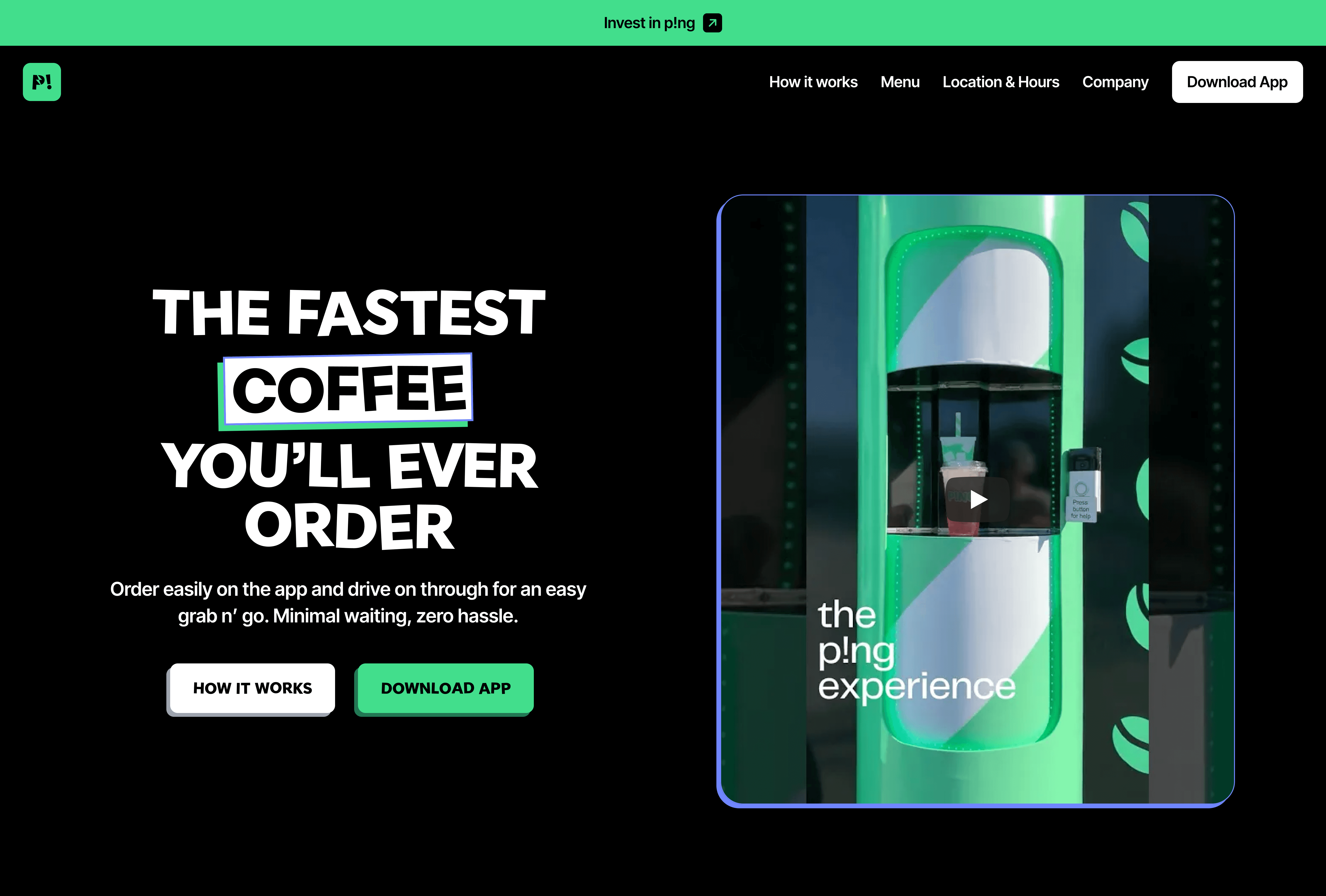
A banner at the top introduces the opportunity to invest in p!ng, with subtle text animation highlighting the range of drinks and a short video showing the system in action.
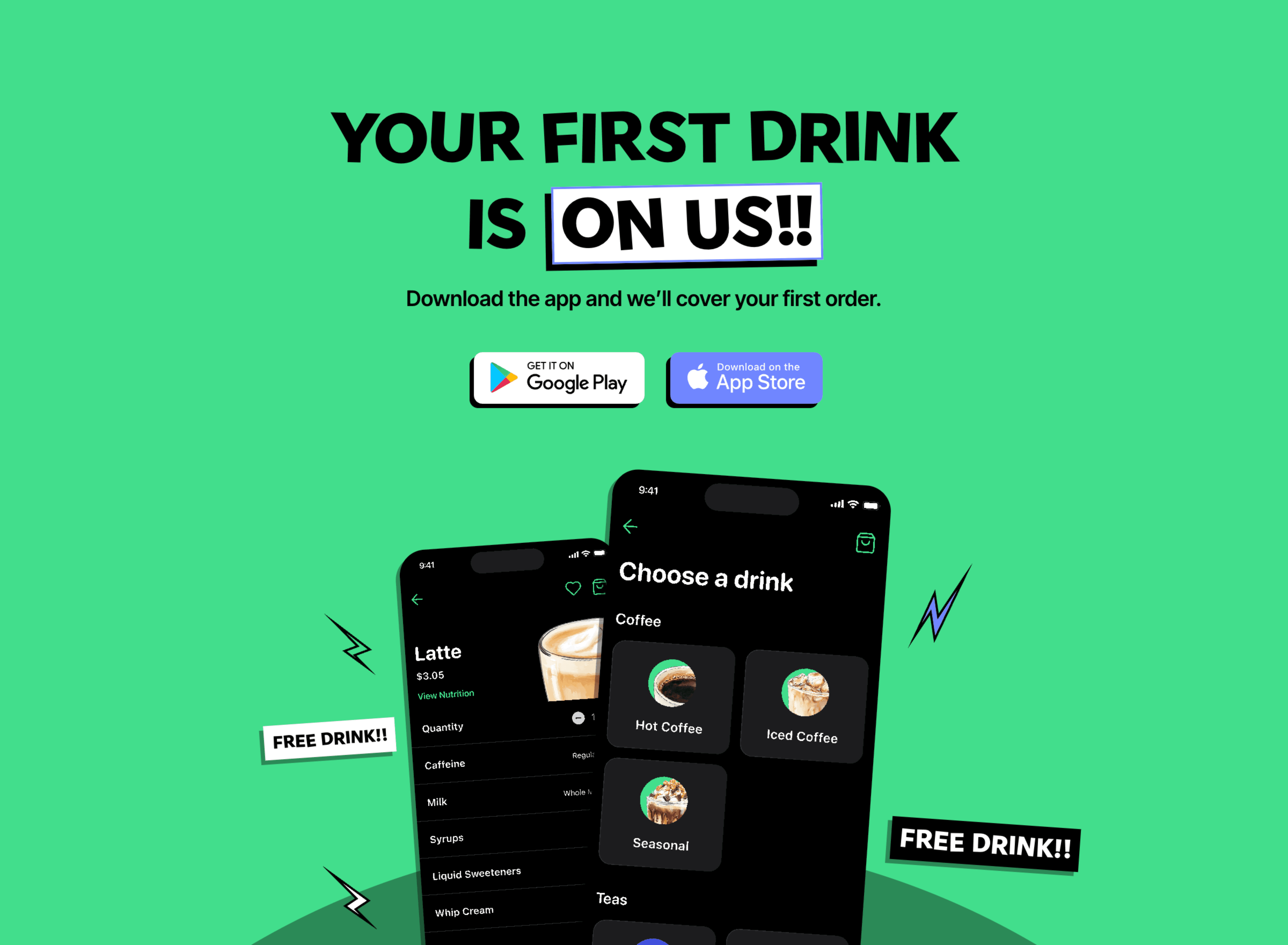
App downloads were a priority, so the site promotes the mobile app by offering the first drink for free. The app is the core part of the p!ng experience.

A bold hero section showcases the variety of drinks and links directly to the full menu.
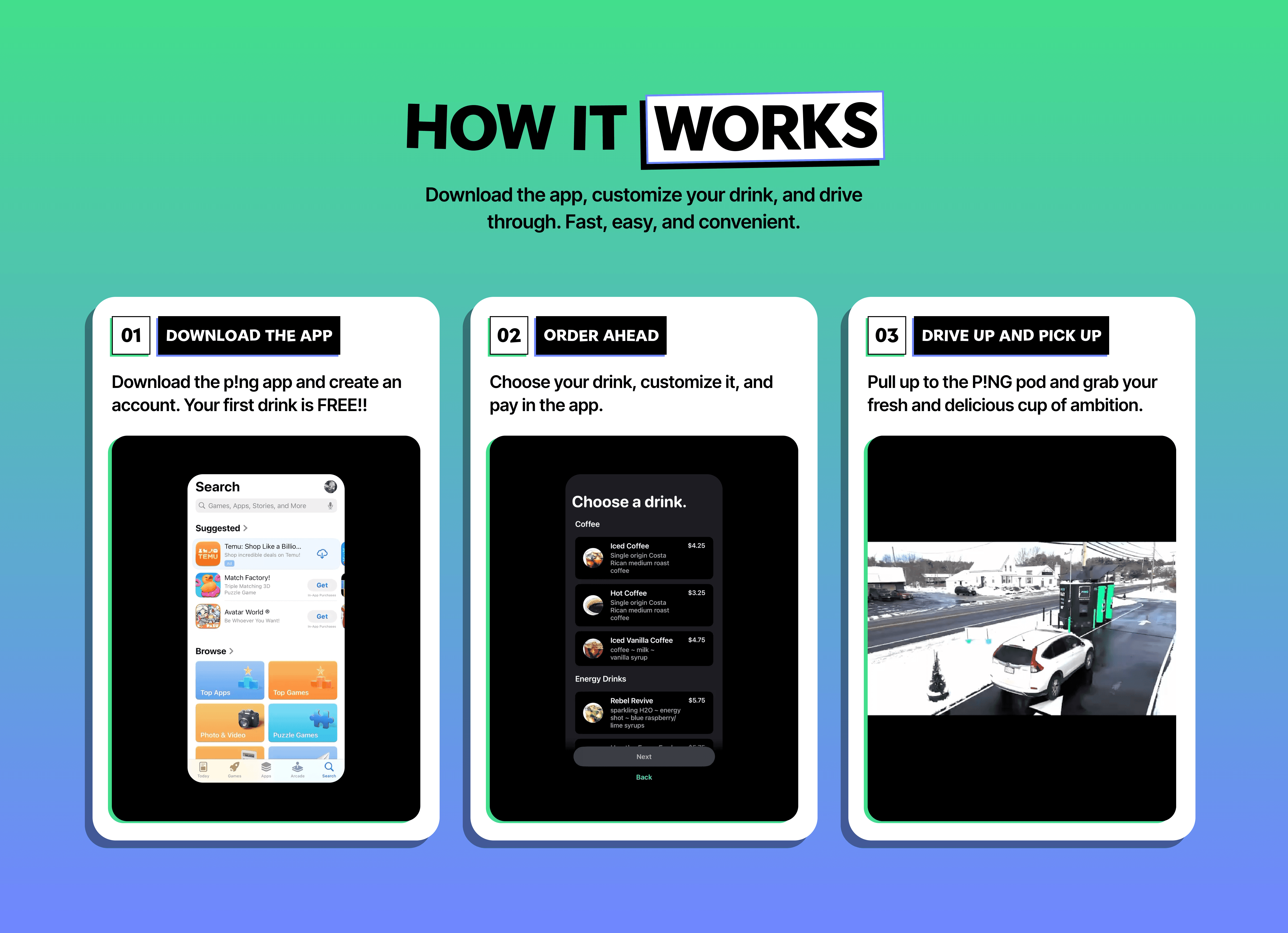
A dedicated “How it works” section uses short videos and supporting text to clearly explain the system.
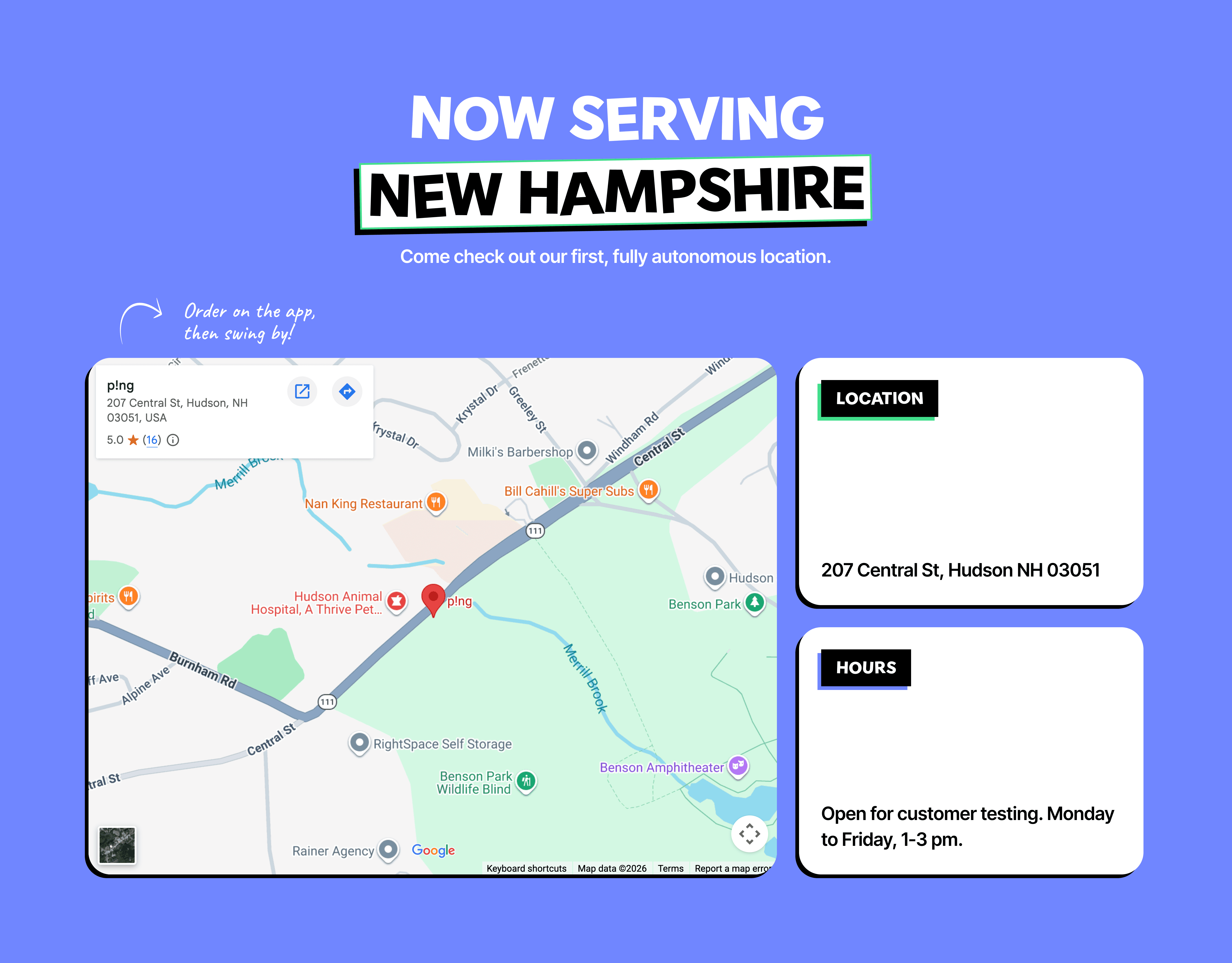
The pod’s physical location is embedded on the site, with the address and operating hours shown alongside it.
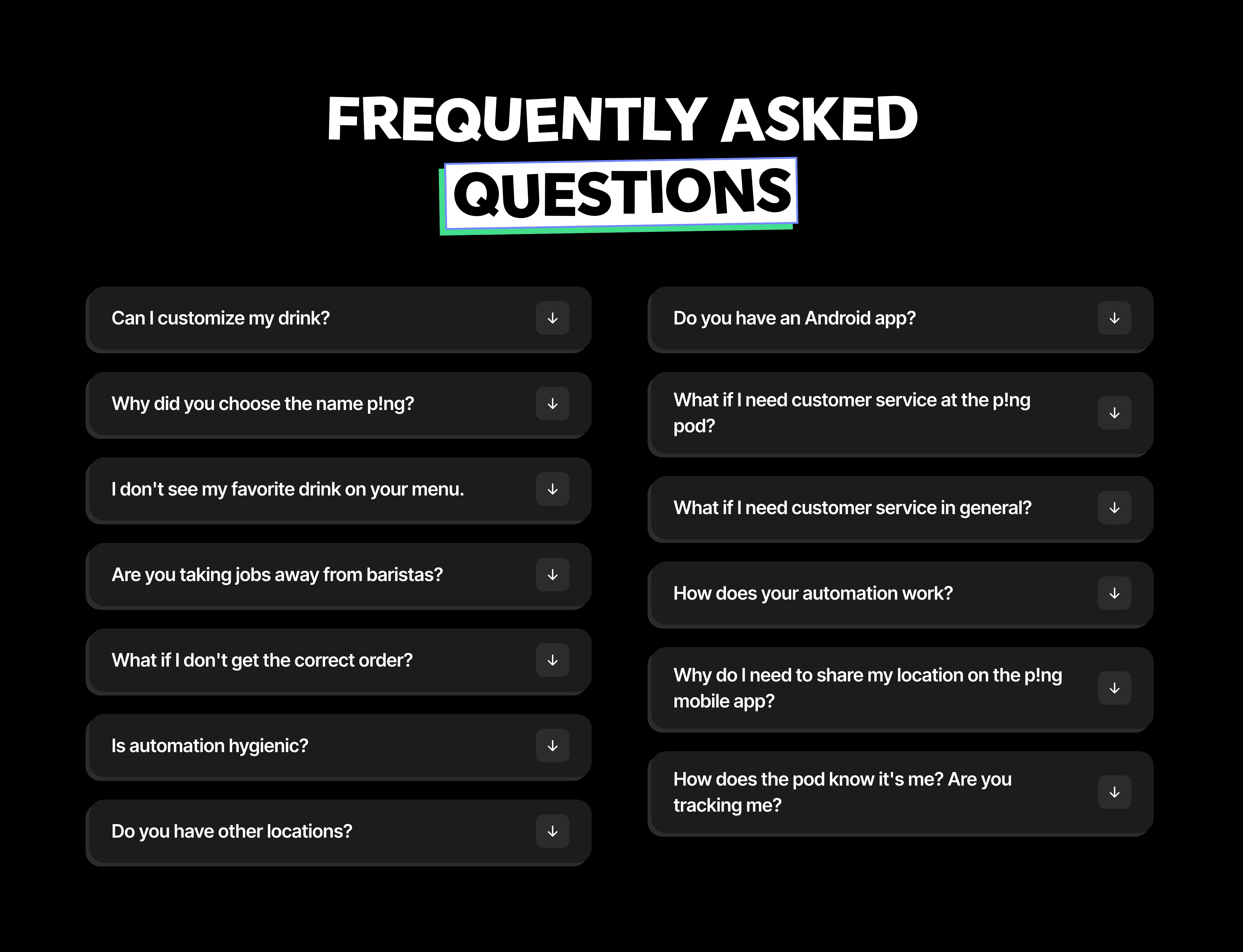
Since there were many common questions, the FAQ was designed using a two-column layout to keep it easier to scan.
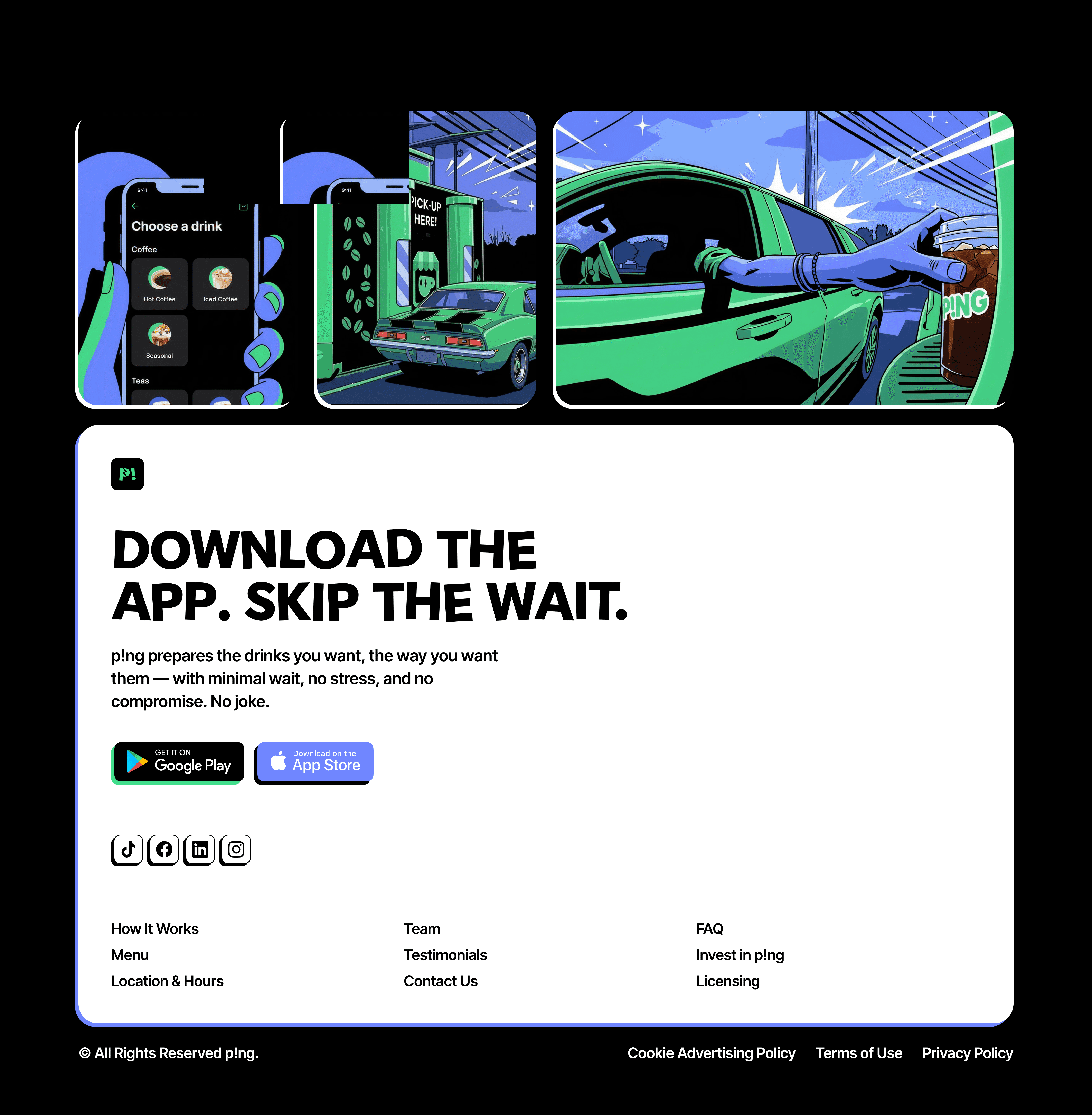
Playful graphics throughout the site reinforce the brand while highlighting how simple and fast the experience is.
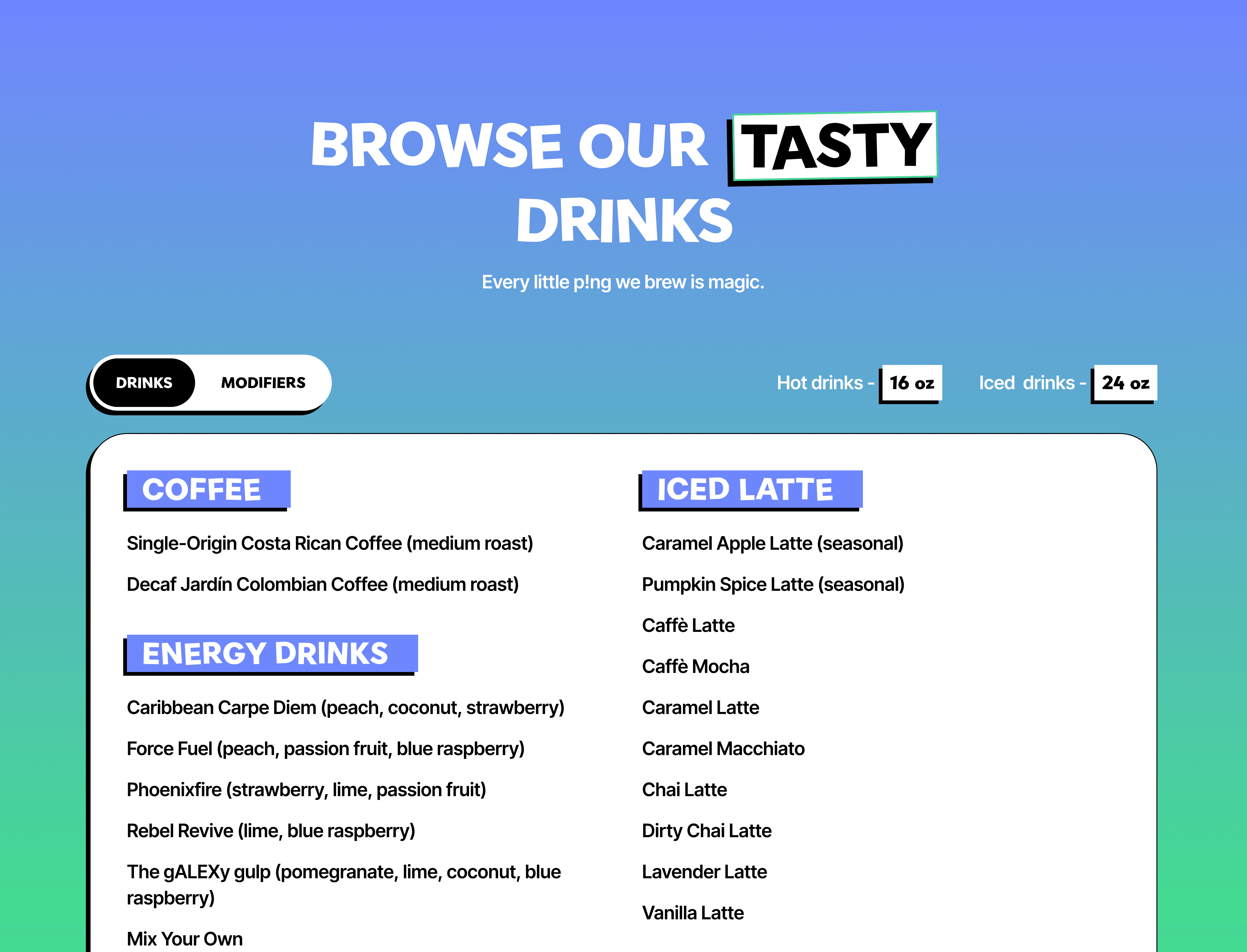
The full menu is powered by a CMS, allowing the founders to add, remove, or update items as the business grows.
ai in the workflow
Generating graphics, upscaling images, brainstorming, and asking questions with AI.
I used ChatGPT, Gemini, and Figma to generate visuals from real-world references, keeping them consistent with the brand guidelines.
Founder Feedback
What the founders said.
Rob
It captures exactly the energy we want people to feel when they experience p!ng.

Jane
They brought our vision to life through clean and modern design, a lot of care to the details.
Key Takeaways
What I learned.
// zero 1
Minh’s guidance helped unblock challenges and refine the final result.
// zero 2
The founders’ product knowledge sharpened clarity and direction.
// zero 3
Weekly feedback loops kept momentum high and decisions focused.
// zero 4
AI can produce production-quality visuals, but it requires iteration and precise prompting.